


Brand Identity For RISE
RISE is a new gym that caters to women. Our brand attributes are empowerment, strength and dynamism.To embrace the brand’s attributes, our visual attributes are active, bold and motivational. We achieve this through compelling images, bold and emphasized type, contrasting colors and an inspirational tone of voice.

A gym where all women are welcome regardless of ability, age, background, size or weight.

The logotype is bold and strong, with a slight curve in the letterform leg. The curvature in the leg adds a feminine touch to the letter which resonates with our brand. The kettlebell is the brandmark for our brand. It’s an easily recognizable symbol in the fitness industry. The curves throughout the kettlebell add a feminine aspect to
a bulky object.
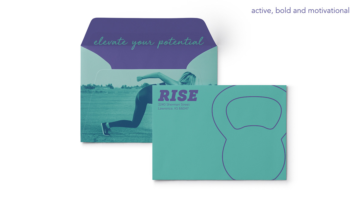
The front of the envelope is clean, simple and features an outlined kettlebell for easy address application. The back contains a surprise with the tagline hidden inside the flap.

These promotional posters were designed as a set, which creates engagement with pedestrians walking by.

The billboard is striking with contrasting colors and sporty photography, which quickly grabs the attention of the passerby.

The RISE app provides many features to our members, class schedules, step-by step in-app training, progress tracking, and more.
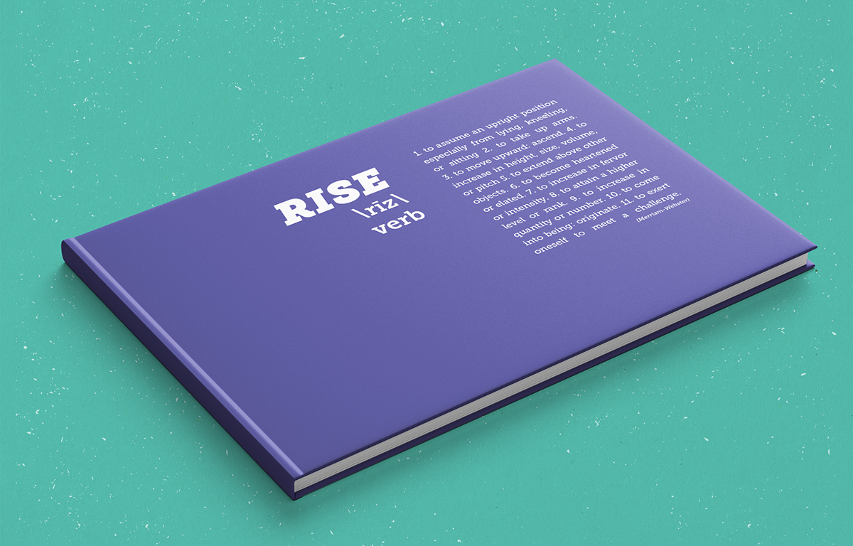
The cover of the brand identity book. It features a dictionary style entry for the word rise.

Inside the Brand (Table of Contents)


